Cat Coloring Page: Try Soft Texture and a Patterned Cushion
This original cat-and-cushion sheet has broad body shapes, a curled tail and a simple cushion. Use it to compare a flat colour with a lightly textured one. The page is an imaginative drawing, so natural colours and invented colours are equally welcome.
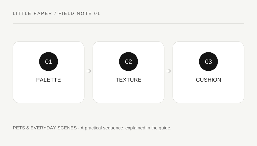
Original explanatory diagram. Examples illustrate a method or decision; they are not claims of personal testing.
Open and check the printable
Use the printable preview or download to open the original SVG sheet. Check that the full border, title and bottom credit are visible in print preview. Choose a suitable fit-to-page setting for your paper rather than stretching the image independently in width and height.
Print one draft copy before preparing several. Printer margins and paper settings vary. Use paper and colouring materials compatible with the equipment and their labels. If children join the activity, an adult should choose appropriate supplies and supervise their use according to the product instructions.
Choose a small cat palette
Select two or three colours for the cat and one or two for the cushion. Try the colours on scrap paper first, using the same paper type where practical. A pencil, crayon and marker can produce different results even when their colour names match.
Begin with the broad body or tail area rather than the tiny facial details. Keep some white paper if you like; an uncoloured area can be a deliberate choice. There is no required coat pattern or realism test in this original illustration.
Compare flat and textured areas
Colour one broad area with a gentle even layer, then try short light strokes on another. Follow a direction that helps you control the tool rather than pressing hard to create instant darkness. Test extra pressure only within the material's suitable use.
Keep the whiskers and facial lines readable. You can leave small spaces near them while working on the larger shapes. If a stroke crosses an outline, decide whether to incorporate it or continue; the activity does not require a flawless boundary.
Give the cushion a different visual job
Use the cushion as a contrast to the cat. A simple stripe or repeating dot pattern can make it feel separate from the fur texture. Sketch added pattern lines lightly where the material permits, then repeat them with comfortable spacing.
For a worked version, use a quiet cat colour and a more colourful cushion, then compare a second copy with those roles reversed. Keep the same drawing so you can see what the colour allocation changes. You do not need to finish both copies in one sitting.
Review one intentional choice
Ask what you chose deliberately: a texture, a colour contrast or a repeated cushion pattern. A short explanation is more useful than a ranking of whose cat looks most realistic. Another person can choose a completely different palette without being wrong.
Let materials dry as their instructions require before stacking pages. Keep a small note of the tools if you want to repeat an effect. This printable is original Little Paper artwork, not a reproduction of a character or museum image. The references support printing and material-use context rather than claiming a therapeutic result.
Before filling the page, draw three small swatch boxes on scrap paper and label them cat, cushion and accent. Try one colour in each, then exchange the cushion and accent colours without changing the cat. This makes a simple palette comparison before committing to the large sheet. The boxes are a planning aid, not an answer key.
On the printed cat, choose only one broad area for the short-stroke texture at first. Keep another broad area flatter and compare them from a normal distance. If the texture is hard to see, adjust mark spacing on scrap rather than pressing more heavily on the finished page. Add a small original cushion pattern only if you still want it. Save the swatch note with the page so you can explain the decisions later, including any area left deliberately white.
Your original printable
Download the original SVG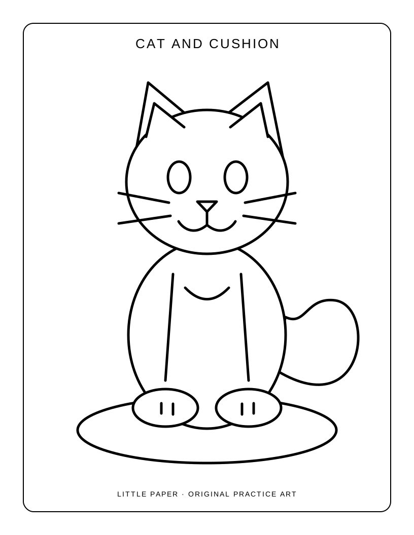
A practical checklist
Choices are saved in this browser. Reset them here or clear this site’s browser storage.
Questions that come up
Must the cat use realistic colours?
No. The drawing is an imaginative practice sheet. Choose natural or invented colours and explain the relationship you prefer.
Can some areas stay white?
Yes. White paper can be an intentional part of the palette. The page does not need every area filled.
Should I print several copies immediately?
Check one draft first so printer margins, scale and materials are suitable before using more paper.
References & scope
Background references checked on 18 October 2026. Worked examples and diagrams are original teaching material.